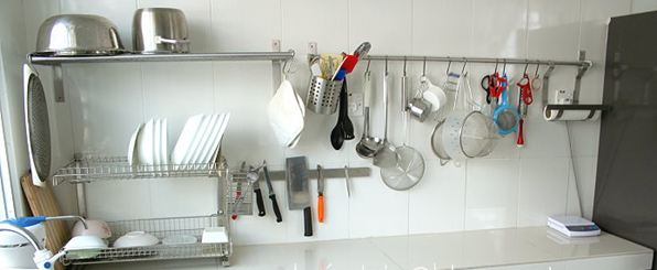
Readiness to hand means that your most needed tools should never be far away.
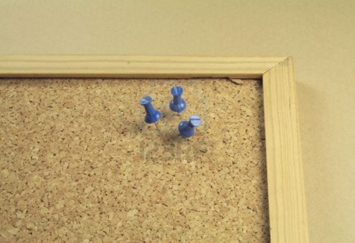
Commonly used things should be easily accessible. For example: Pins for the cork-board are most usefully kept on the cork-board itself, rather than in a storage closet.
A kitchen or a work-bench will evolve a natural placement of things. Stuff that gets used a lot floats to be closer to the work-area. Less frequently used things go into drawers or on shelves.
After cooking a meal we clean up the kitchen: things go back into their proper places. The “proper place” for something is usually a function of how frequently it is used, as well as size and weight. So the fine china dessert bowls go into a cupboard, while the everyday dinner-plates never go further than the drying rack by the sink.
If you need to make an effort to do something, it is less likely that you will do it. Effort is not just physical effort, but also mental or cognitive effort. In other words, if something requires a lot of thinking or fine adjustments you will tend to avoid doing it.
Progressive Disclosure
Commonly used controls should be in easy reach. Less common controls can be hidden until needed. This is a trick known as “Progressive Disclosure”. You can see one common example in the browser BACK buttons:
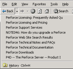
Click on the BACK button takes you one step back.
Click on the dropdown arrow to let you go back many steps.
The common case is easily performed, while more advanced controls are nearby without cluttering up the interface.
Graphics programs will do something similar with color palettes:
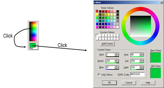
A simple click in the color in the toolbar will set the color directly. You might not get the exact green you want, but it will be roughly the right one.
Clicking on the green color opens up the Color dialog where you can specify the color with accuracy using three different methods. The dialog trades accuracy for directness.
Ready to Hand
Outlook 2013 does something interesting with messages headers when you mouse over them: a FLAG button and a X (Delete) button appear.
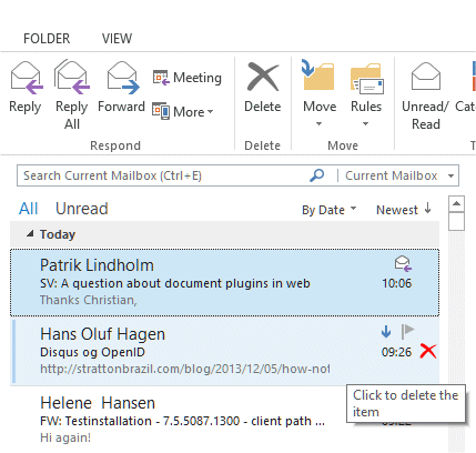
This makes it easier and faster to delete mails after you have read them. Instead of having to move your mouse up to the toolbar, the X button is near where your mouse is.
Something similar happens in word when you select a block of text.

A small toolbox of commonly used controls appear next to the cursor. If you move the mouse pointer away, the toolbox fades out. If you move the mouse towards to tools, it solidifies and you can easily change fonts or bold the selected text.
SuperOffice tries to keep useful tools easily available.

The buttons at the bottom of the window are always available. They do not move around – they are always where you expect them to be.
What other things in SuperOffice should be more easily accessible? We can always do better
