A user interface is made up of thousands of dots. The dots are identical, although some have different colours. There is nothing intrinsic that says a particular dot is more significant than another. What is significant in the picture is up to the viewer: our interpretation of the pointillist picture makes meaning. How can we as designers help the user interpret our digital paintings the way we intended?
Signposts

Which button to press?
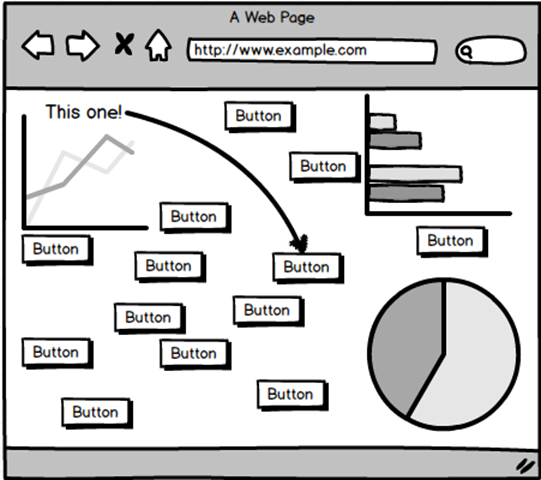
My teacher once told me that I had failed as a designer if I had to resort to putting literal arrows on the screen to guide users to the right place.
So instead of signpost arrows, we have various “tricks” we can use to guide your interpretation of the user interface. They are based on psychology – in particular Gestalt theory.
Space

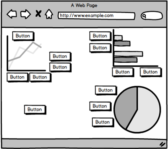
Things placed next to each other appear to be related to each other. Things which are not placed next to anything (surrounded by lots of white space) appear alone, and therefore stand out from the crowd.
Using whitespace and layout is one of the most important tools in the designers repertoire. The challenge these days is to translate a layout from a large screen to a smaller phone or tablet screen, where space is at a premium.
A phone’s display requires a different layout and use of space. The less important functions are dropped in order to focus on the most important aspects. Instead of developing just one layout, modern design techniques require three or four different layouts to cover the full range of devices.
Size

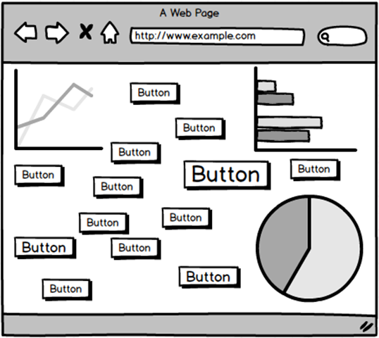
Larger things are easier to see. Some tricks are less subtle than others.
Size varies linearly – the relationship is pretty obvious. Big = Important. Small = not so much.
Colour

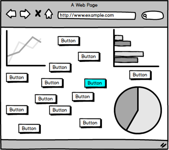
Colour – used sparingly – can be very effective at highlighting an element. However:
- If everything has a different colour, nothing stands out. Colour highlights require that everything else be bland.
- Some people are colour-blind, so you should vary intensity as well as colour.
Colour is not ordered in a sequence, so there is no way to say that “blue” is more than “green”. This means that we should not use different colours to indicate sizes or numeric quantities. We can use them to indicate different categories, but not numbers.
Intensity is ordered, so we can say that “black” (no colour) is less than “dark blue”, which is less than “light blue”. In other words, it makes sense to say that 0 = black, 50 = dark blue and 100 = light blue.
Grey is Disabled

Lower intensity is used by the operating system to indicate that a control is disabled, so be careful not to confuse the user by using grey as a colour. The user will avoid clicking on your button, which means it might as well not be there.
Showing the Way
So instead of painting arrows across our designs, or writing user manuals or help text that no-one (except for the QA department) will ever read, we can use these visual psychology tricks to guide the user to the next station along the way.
If you are looking for a CRM that has been designed with ease of use in mind, schedule a free demo with SuperOffice today >>


