“The most important goal of effective communication is clarity. Clarity is not the same as simplicity … Complexity can be made to appear clear by effective organization […]. Clarity refers to the focus on one particular message or goal at a time, rather than attempting to accomplish too much at once.” – Michael Hoffman
Clarity can be created through simplification, but not everything is amenable to simplification.
Clarity vs Simplicity
Simple things are usually clear all by themselves. The trick is making complex things clear.
Clarity requires intent. Without a clear goal, you will struggle to explain where you want to go. Unfortunately I know of no easy rule for distilling the intent.
Simplification
We already discussed how to simplify designs. John Maeda is a designer out of the MIT Media Lab. He wrote a book about this - the Laws of Simplicity.
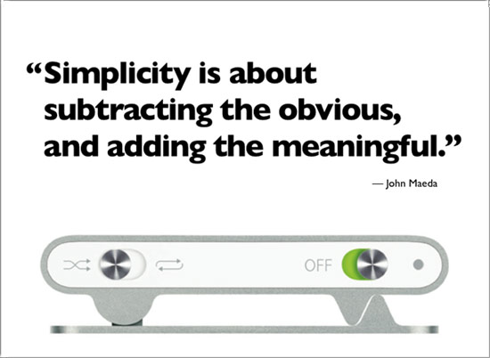
Asking each part “are you really, truly, honestly necessary?” helps us simplify. We can remove clutter, but sometimes we have several things which we absolutely, positively must have.
Sometimes the relationship between different elements is vital to understanding the intention. Simplifying into separate pieces can lead to a loss of context.
Consider this wizard: every page has been simplified to the minimum:
Each step is very simple, but the whole process is not really clear. Remember when you are looking at the first step in the wizard, you don’t know what is coming on the next screen. The user has to remember what was on the previous screen and what was typed there. We have traded simplicity on the screen for complexity in the user’s head. The intent of the screen is clear, but the screen does not fulfill the intent; it only fills part of the intent. Maybe a wizard wasn't really necessary? Maybe a simple one page dialog would be clearer?
Clearing Things up
Intention: what are you trying to achieve?
This page explains what clarity is, and illustrates some techniques for improving clarity in your own designs.
The next few sections will hopefully give you some ideas for attacking stubborn complex problems in your own designs.
Reframe
Instead of trying to find the core message in the parts that we have, another approach is to try to restructure things so that we have new parts. A complex problem can appear simpler with a different perspective.
This may involve coming up with new categories for things, or coming up with a new way of organizing. If the answer you have is too complex, try asking a different question.
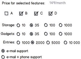
For example: you might have a complex pricing system with lots of different options, with a web calculator to help the customer :
This is super flexible and quite advanced. Customers can put together exactly the package that they want. The problem is that customers often don’t know what they want, and when faced with too many choices, humans will avoid making a choice out of fear of missing out on something. See the fascinating book Predictably Irrational for a look at the psychology behind this tendency.
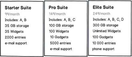
We re-frame the complex decision by offering pre-assembled suites – reducing the number of variables the customer has to consider, and hopefully making the decision easier.
With only three options to choose between, the customer should feel less overwhelmed by complexity.
Reorganize
Move the pieces around. Try organizing by time, by size, by name, by place, by hierarchy.
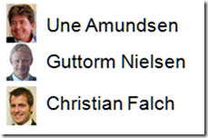
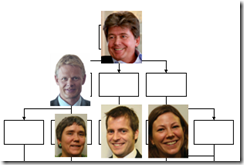
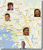
For example, if we have a collection of people we can present them as a list or through the organizational hierarchy:
Different information structures reveal different relationships.
- Lists are easily sorted, searched and filtered. Using multiple columns a list can communicate a lot of information is a compact space.
- Trees are less easy to sort, but show who is the boss of who. The tree makes it easy to summarize or hide a chunk of the tree. Relationships become visible that are difficult to spot in a list.
- A map displays position, but also reveals clustering/grouping information that might not be easy to see in a list or tree.
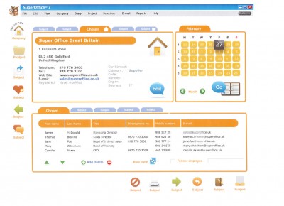
A powerful technique is to hide “advanced functionality” so that it does not distract from the most common uses. SuperOffice does this by putting extra fields and interests on separate tabs. Most of the time you are looking at name and address information, but the other information is within easy reach without crowding the main screen. This is often called "progressive disclosure".
Rephrase
Maybe a different emphasis will make your intent clearer? In user interface design the various buttons and controls communicate intent through their visual appearance and their context.
Dropdowns vs Radio buttons vs Checkboxes
These three are equivalent, but one is much clearer than the other. The intent “not exclusive choices” is clearest when using checkboxes. The radio buttons are easily mis-read because the eye likes vertical groups more than horizontal groupings. The dropdown menu uses two clicks to change a selection instead of just one.
This is equivalent to copy-editing a user-interface. Rather than a full re-write, you are working within the structure you have; just changing a word or widget here and there to try to make things clearer. Jason Fried writes about the details of the re-writing process – showing how to cut 40% of the words in a sentence without losing meaning.
Restart
Some things are inherently complex, and are difficult to simplify by just eliminating distractions. Maybe the pieces you have aren’t the right pieces. Maybe you need to start over? The 37 signals redesign story is worth reading: it shows how designers explore many different solutions before synthesizing a final result based on what was learned.
The first couple of ideas you have are the obvious ones that everyone thinks of. It's the next ten or twenty ideas that force you to become creative; to push the boundaries and really think outside the box.
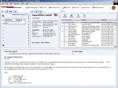
This is a sketch of different SuperOffice user-interface direction. We didn't end up going this direction, but you have to try something before you can reject it.
This is an example of a completely different approach to organizing the information in SuperOffice. It is a fun idea, but ultimately proved to be too confusing. Too much information at the same time, with no clear purpose to it.

