“Everything should be made as simple as possible, but not simpler.” – Albert Einstein
“Omit needless words” – Strunk & White
Why Simplify?
You can picture a website as a maze, with every web page as an intersection with many exits. A well designed website should not be a confusing maze, but pleasant stroll along a well lit path with clear signposts along the way.
Every link you add to a web page or a newsletter is another decision point, another twist in the maze. Every turn in the maze is a chance for the customer to get lost, lose interest and walk away.
Remove Distractions
“Less is more” when building something that others need to understand. The more stuff there is, the more opportunities for misunderstanding, more opportunities for the reader to give up and go elsewhere. If you remove the distractions, you should be left with just the essential elements.
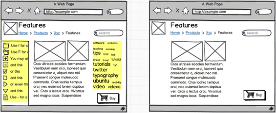
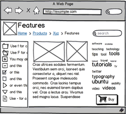
On the left is a typical product web page. The highlighted areas are distractions. They are opportunities for doing something else other than the next correct thing; which leads to lost sales. Don’t fear the white space. The space makes the content stand out.
Eliminating the tag clouds and the navigation menu makes the page simpler and clearer.
The Buy button in the corner is the important thing. The feature descriptions are probably important in making the buy-or-not decision, so we want to keep those. The user would probably feel nervous if the logo and the navigation suddenly disappeared, so that stays.
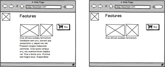
If we continue simplifying, it becomes clear that you can have too much of a good thing.
Taking away the navigation makes the page too simple, removing useful context for the user. Trimming the description just makes the page less useful.
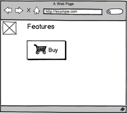
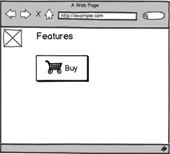
Reductio ad absurdum, we take away everything but the title and the call to action.
The BUY button is the important thing, so why have anything else?
“As simple as possible, but no simpler” as Einstein said.
Links and Fields Add Complexity
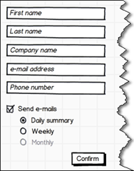
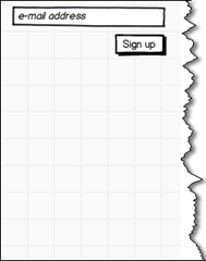
Compare these two signup forms. Signup forms are a barrier that users need to climb over in order to get to the good stuff. The smaller and easier it is to surmount that barrier, the more signups you will get. Research shows that more fields equals fewer completions. Complexity can cost you money.
“But I really need the Company Name/Phone Number/Summary!” the strawman says.
“Fine,” replies the designer, “but be aware what you are trading off. What is most important? The signup itself, or the amount of information we get?”
If you know what is really important, then you know what you should focus on, and what to cut away.
Simple, but Not Too Simple
How much is too much? When should we stop simplifying?
The trick is to try too hard. You won’t know you’ve crossed the line until after you’ve crossed it. Try taking away a bunch of stuff, and then take away some more.
If people are complimenting you on the new airy and minimalist design, then you haven’t crossed the line yet.
